Friday, November 30, 2007

ALICE IN WONDERLAND: Autumn Leaves


I thought this background from ALICE IN WONDERLAND had a decidedly Autumnal feel to it, as well as the strong influence of the brilliant Mary Blair. It's from the "A E I O U" song sequence. I hope you enjoy it!

This is the last day of November. I've been waiting for months for December 1st, so I could post Holiday related artwork. I've prepared lots of wonderful treats for good boys and girls. Be sure and check back tomorrow...

:)

Wednesday, November 28, 2007

DONALD AND THE WHEEL (1961)


This re-created pan background is from the rather obscure Disney film "DONALD AND THE WHEEL."

To be absolutely precise, this is just the "Roman" section of an incredibly long pan B/G which takes us through several eras in history. The Egyptian section which precedes this is a hoot, I'll re-create it one day.

This was one of the B/Gs that took far longer than anticipated. Since Donald was flying across the landscape in a chariot with two horses, I could only grab small sections at a time. But it's a B/G worth a good look. The design is lean but very stylish.

Et tu, Donald!

Tutoring w/ Stephen Gregory week 4

So this weeks session had to be postponed til the next, but here is where I currently am; implemented Stephen's changes, still polishing body mechanics, and have yet to move onto facial. It's not there yet, but I feel like its starting to come together. I'm spending alot of time actually slowing down a lot of parts, so its starting to get much longer than its initial 200 frame intention. But I really feel like this doesnt work unless I allocate the right amount of frames to keep things still.

**Update: I polished mechanics alot more and made passes at facial animation. Still have to iron out a lot of arcs.

So I was talking about James Baxter last week. If you wanna to see some beautiful 2D animation of the highest quality (and get in touch w/ your inner princess) check out Enchanted! Baxter's studio did the 2D animation and it is some seriously amazing stuff! The look was real Art-Noveau, Alphonse Mucha inspired, which worked really well. As usual, I made Cheryl stay after w/ me to watch the end credits and see who the animators were and it was just this superstar list of 2D guys like Andreas Deja, Mark Henn, Rune Bennicke, Jakob Jensen and more. It was great to see that caliber of traditional animation of the big screen again!

**Update: James Baxter Animation posted their Enchanted Reel online. Check it out Hurry!

Tuesday, November 27, 2007

THE ARISTOCATS: Boudoir Part Two

THE ARISTOCATS (1970): Madame Bonfamille's Boudoir


THE ARISTOCATS backgrounds are rich with sumptuous detail. (This re-created pan B/G is from the scene in which Madame Bonfamille does the tango with her lawyer.)

Monday, November 26, 2007

CHIP AND DALE: Winter Approaches!


As Fall fades into Winter, I thought these backgrounds from "Working For Peanuts" seemed an appropriate choice. Time for apple cider!

You can almost feel the wintery chill in this artwork.

Coming soon, in December... holiday backgrounds from classic Disney films. Can't wait!!!

Sunday, November 25, 2007

A Word About ENCHANTED...


This blog pretty much always "stays the course" with its subject matter. However, the theatrical opening of ENCHANTED deserves, no, requires mention this weekend.

The Walt Disney Company has triumphed. The opening segment, in full-blown classic 2D animation is more than a joy, it is a masterpiece. It was created for Disney by former Disney animator James Baxter and his crew at James Baxter Animation. And it ranks among the best, most beautiful animation ever created.

Actually, the whole movie is a long-awaited return to the essence of what we've always loved about Disney: sweetness, humor, heart, imagination, dazzling visuals, irresistable music, and a happy ending!

And for those misanthropes who proclaimed 2D animation dead, I am happy to say you are completely and utterly clueless. At the El Capitan theatre in Hollywood (where I perform), I have watched the faces of guests light up with delight. There always was, and always will be something absolutely magical about drawings that move, these living illustrations with personality and feeling.

In this age of world-wide turmoil, how wonderful it is to spend a couple of hours with a movie that leaves you smiling, uplifted, and inspired.

Congratulations to everyone involved in this wonderful movie.

Run, don't walk to the theatre to see, and be, ENCHANTED.

Saturday, November 24, 2007

DUMBO (1941)


Our Italian correspondent Andrea Giglio has sent more incredible backgrounds.

His generosity will enrich this blog for months to come. Here, a beautiful B/G from DUMBO.

Wednesday, November 21, 2007

From Italy: CINDERELLA!


Passion for animation art is an international phenomenon. Today I received an email from Rome, Italy! The writer was a very gracious gentleman named Andrea Giglio. Andrea sent several CINDERELLA backgrounds he digitally re-created to share with the guests visiting my blog.

Thank you Andrea! Sharing these is incredibly generous. The B/Gs are bella. Grazie!

Tuesday, November 20, 2007

FACA: The Bad News Boos

So while I was waiting for the animation tutorship to start, I thought It'd be fun to enter a competitor in the upcoming Fist-a-Cuffs competition. This one was slated to involve a tag-team AND a manager, so I hooked up with 2 guys that were looking for a 3rd. They turned out to be 2 great, talented dudes, Mitch and Greg, and heres what we came up with. There were a lot of ideas thrown out, but we all agreed to the idea of a paper route manager who posessed the souls of 2 paperboys to do his bidding.

Here is the rough idea and final color of my contribution, Suzy Spectre.
With the others' contributions, We were the Bad News Boos!We made it past the first round, only to be stopped in our tracks the second round by "When Nature Calls You Out." I only got to do one spot of smak talking, which admittedly, is kind of crappy.

Still, it was a lot of fun to do. It went suprisingly smooth and both teammates were extremely creative and fun to work with.
Go Boos!

MIM'S COTTAGE (The Sword and the Stone)


Re-created pan background...

Tutoring w/ Stephen Gregory week 3

Wow! Week 3 was such a great session man. Even made me forget about all the tech problems I was having last week. Not only because it was virus-free, but Stephen had a bunch of visual aids and we framed by framed some shots, both work in progress and finished.
Here is what I submitted to Stephen this week, basically incoporating his notes, and adding breakdowns and smoothing out holds. "Blocking plus", but far from polish. I felt okay about it, but after a while I never could tell.

And here are Stephen's notes.

Honing in on a specific part of the assignment. Essentially breaking down where I could begin to go in and clarify the acting ideas by specifying how I wanted to move in and out of the storytelling poses. The spacing and timing of key things like anticipating and dragging of the head, pushing the arcs on the chest and shoulders, for example, would all contribute to what the specifics of the acting would be.

Which to me was the biggest lesson of the night, the key poses would tell the story, how you animated between those poses would sell the acting, and therefore the sophistication of the animation of the scene.

Following blocking and getting into rough animation, he usually starts really animating (working out the curves) with the hips and branches out into the spine, then to the extremities, head, and so forth. Usually working in FK arms. He works pose to pose but usually ends up "hiding the poses" as to make it feel more organic. Breaking up the different elements of the body helps achieve that.

I asked him about moving holds and my attempts to throw in "random, ambient movements" to keep a pose alive. Nothing should be random, subtle movement shifts (keep-alives) should come from thinking about the physics and inertia of moving from one pose to another. How each part of the body settles, overshoots, or begins to sets up another pose, at times independently from one another. Its actually very difficult for anything to come to a complete stop without some specific residual movement. Well, where is that coming from? None of it is random.

I also heard in the recent Spline Doctors Roundtable that Stephen felt that you could essentially do a scene with one pose. I mentioned that while I was at Animation Mentor, the biggest comment I'd hear watching the acting classes was to consolidate the number of poses. That "you have 3 poses here when you could be telling it with one." He showed me a scene he did from Monsters Inc where he blocked out the whole scene with just pose. A story pose in which, you could be able to read the jist of this scene with just this one pose. That kind of "less is more" approach struck a chord with me. Thats what generally describes my taste in all art. Now obviously, he would later go on to animate so it was more than just that one pose, but it all would work within that key pose and support it. This whole idea may seem contrary to the paragraphs preceeding this one about "hiding the pose", but I think its just a way of simplifying your scene. And to not have to feel like you have to hit a different pose for every single beat of a dialogue.

We then went through a James Baxter scene in the Rescuers Down Under, of Wilbur, the albatross, dancing while he delivers some dialogue. This scene was a prime example of one being able to spot the key poses if you frame-by-frame it, but you can also see how in depth James is thinking about moving in and out of these poses, and thus not making them so apparent so the whole thing feels organic. When the shoulders are leading the movement here, bringing up the ribcage but dragging the pelvis, so as to cause a nice stttrrretch in the body. How, when the pelvis comes down it makes a nice arc in its path of action setting up the next pose. How the wings are leading or dragging, while the graphic arrangement of every element in each drawing stages the action so that it reads clearly. I mean, there was just so much going on there. I felt like I was watching a magician at work, as cheesy as that sounds. But it was beautiful man.

We contrasted that scene with the one directly preceeding it, that he thought kinda sucked. It had the same character, essentially moving from one pose straight into another, with seemingly little thought to what lead to what was inbetween those keys. And sure the keys were okay, but it lacked that the particularity of movement inbetween those keys. And it paled in comparison. I was really quite blown away by the difference.

Stephen was like." right now your shot is that scene, "this week I want you to get it to James Baxter level."

Haha, Surely I wont come anywhere near that . But I'd probably get alot further if I shoot for that degree. So thats next week's assignment.

Sunday, November 18, 2007

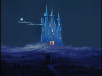
CINDERELLA: Pan Background


Here's a re-created pan B/G from CINDERELLA. Beautiful blue color palette, with lots of lovely detail. This is the scene seconds before the Fairy Godmother arrives...

Wednesday, November 14, 2007

ALICE IN WONDERLAND: Bread & Butter-flies


This ALICE IN WONDERLAND background is a marvelous example of economy of detail and subtlety, yet brimming with style. Great colors, too, don't you think?

THE SWORD IN THE STONE: Merlin's Entrance at Mim's


Merlin makes a magical entrance in THE SWORD IN THE STONE through this doorway at Madam Mim's cottage. With the sparkly whirlwind, it's easy to miss the background within a BG, including a very spooky tree trunk reminiscent of the SNOW WHITE scary forest scene. Here, all the details appear together, unobstructed.

Monday, November 12, 2007

Tutoring w/ Stephen Gregory week 2

So leading up to this weeks session was a little nightmarish for me because my computer was, and is even now, infected with trojan viruses that make it impossible for me to work on anything or even check e-mail without having to close out 20 popups and one time coming up every two minutes. It was so bad that I couldnt get on to correspond w/ Stephen. So we did tonights session over the phone, which was actually really cool, what w/ no hiccups and all.

Frankly, I was a bit embarrased of my submission to Stephen this week, as I didnt have a lot of time to work on it, and when I did get the time, I was combating viruses and such, which sucks because I hate making excuses for not getting stuff done, or done well. I started out wanting to do something like this:
Where smitten guy in class is checking out girl, gets caught, and sheepishly feigns looking elsewhere, Stephen thought the idea a little bit generic, but to go for it anway. Here are some things he wanted me to do and think about before jumping in:

Start off by thumbnailing or writing down acting ideas you want to hit. Emotions poses etc. then take that with you in front of the camera and try acting out those ideas. Eventually it will all start to flow naturally and by the 10th or 20th take in front of the camera you might have some interesting stuff happening you can use for your test. This idea is typical of student work and the only thing that will separate it from the typical, is if you just don't animate your first idea. You'll need spend enough time working it out in front of a mirror or camera to break away from the typical. The other thing is don't try and copy the acting of this moment from "Superbad". People always pick up on acting that is taken from other movies.

Oh yeah that DID happen in Superbad! Maybe thats where I got it from. And 10-20 times ?! Yeah. He mentioned that on the first couple of takes, he's thinkin too much about hitting beats, dialogue, etc. And you can see that in the takes. But by the 20th take , its starts to feel a little more natural and begins to flow a little better, and you're not consciously thinking about it so much. And that those first couple of takes are kind of like rehearsals.
And I wasnt comfortable w/ him thinking the idea was so typical, so I changed up the idea and went for this:

Eh. I thought it was kinda funny when I was working on it. But when I came back to it after watchin the Hawks game I was like ,Oh, Thats pretty bad. Oh and also still pretty typical. And that timing there is ridiculous. But I had to send it off anway.


So above are Stephen's notes and feedback. The main issue for him was the length. The assignment was preferrably to be around 100-250. Mine clocked in at around 450 frames. So as seen in the video, he suggested trimmin the fat in the beginning, and getting it down to one pose that read panicked, confused, and frustrated, and then I like what he did w/ the end. Where he kind of flirts with the girl, she's repulsed, and he has an opening to check out her paper. Google Video cuts it off at the end but after she turns away, he takes one more quick peak down at here paper. It ends quicker and it made me laugh when I saw it.

I think we're gonna meet up again this week to go over more stuff in-depth, so hopefully issues w/ my comp are all worked out by then.

We also talked a little about workflows. He likes to work in copied pairs and I do too. Copied pairs is where you have your key poses, and work out your timing by copying your key poses over so that it gives a hold, transition, hold , transition, hold result. I did alot of stepped in AM but only because I just wanted people to see just the poses during first pass. But even at work its usually copied pairs. A lot of people I saw that were completely new to animation, one of the hardest things to do was to transition from stepped to spline. He mentioned that, yeah, a lot of 2D guys at Pixar felt more comfortable with stepped ( because its like the pose-to-pose tests in 2D). But as they got more comfortable w/ the computer, they were all about the splines.

Speaking of Pixar, I asked him what some of the things were that usually blow people away, sitting in dailies. It's usually the acting choices.. The choices that are made, how true they feel, and how well they fit in those moments. And to top that off, are just well executed, great animation. It reminded me of something I read James Baxter say, "My goal is to combine good performance with strong technique. It is only with strong technique that you can deliver the good performance with maximum impact."

So yeah for this weeks work, heres to less viruses!

Disney's RATTLED BY RATS (1925)


Disney represents the pinnacle in sophisticated animation. It's easy to forget that the art form was completely re-invented by Disney artists during the decade prior to SNOW WHITE (1937).

These backgrounds are from Disney's RATTLED BY RATS (1925). It is downright amazing to think animation art this primitive paved the way for the studio's future brilliance.

But Walt was innovating even in his silent films, combining live action with animation, which ultimately led to classics like MARY POPPINS.

"The old Maestro" actually animated the first six Alice comedies himself. Their modest success allowed him to hire more artists.

I'm not sure exactly when Walt quit animating, but it's not impossible that Walt himself might have drawn one or more of these BGs!

Sunday, November 11, 2007

FACA Ring Card Girl

Sweet! This "Ring Card Girl" won a spot to be a ring card girl for one of the upcoming rounds of Fist-a-Cuffs, in which I also entered a fighter, so look out for that! Thanks to everyone who voted! Its crazy to think about how big this competition has become, how many people enter and vote, and its all on one man's blog! I'm a big fan of alot of the massive talents that post there, so its kinda cool to be part of it all.

I believe the rounds start this monday! This time around it is a tag team battle WITH a mananger. So check it out!

Fist-a-Cuffs.

JUNGLE BOOK: Lush Underbrush


From the JUNGLE BOOK scene where Mowgli searches for a better look at the little girl, here is the re-created pan background. Gorgeous! The lush tropical landscape is beautifully executed. Note: the three large leaves in the right foreground (which were effecively animated using the multiplane camera layers).

Thursday, November 8, 2007

Chip and Dale: WORKING FOR PEANUTS (1953)


This shows how modern Disney could get in the 1950s. Very clean graphics... refreshing and stylistic.

Wednesday, November 7, 2007

GOOFY: LION DOWN


Here are three very different backgrounds from the GOOFY short LION DOWN; a backyard patio, an aerial view, and a bedroom.

THE SWORD IN THE STONE


This elaborate recreated B/G from THE SWORD IN THE STONE is fairly busrting with detail and a very eye-pleasing color palette.

Monday, November 5, 2007

Tutoring w/ Stephen Gregory

So tonight was my first meet-up with Stephen Gregory for our tutoring program. So without further ado, we'll get into some of the things I took away from tonights meeting.

One of the things that he sees, seperating the great from the so-so animation reels is the thought process. The feeling that this person actually sat down to think about what the character is doing, and why they're doing it. That "quality/spark/x-factor(whatever you wanna call it)" is intangible when you see it , and its hard to describe, but you can see when it's there. Animation, now, more than ever, is so accessible, and there are lots of people who can just learn to move a character well. Learning to break down who the character is, any why they make the choices they make, is the harder part.

Another is giving the people reviewing reels, something they've never seen before. Between school classes, submitted reels, etc., they see it all, and everyone is essentially doing the same thing. What catches their attention is something they've never seen before.

Short films give insight to who candidates are on a personal level, which can leave a lasting impression if done well. They give you a sense what someone's about, the stories they want to tell, qualities that are important to them. Stephen actually likes seeing great films. On the other hand, most student films are pretty bad.

That said, great animation can get you an interview, but at Pixar (although not necessarily every other studio), 60- 70% of the time, what gets people hired is they're personality, and what they bring to the table, what gaps they fill in the team, are they someone who could work well with the team. What makes them unique.

And now! His comments on my present reel (which you can find to the linked on the right-hand toolbar):

The opening baseball bit:
-Too many ideas, think about simplifying. It seems like you're rushing through the thing to hit every single idea.
-Timing is too even (this goes for most of the reel)
-Overall, Need to work on finish, polish on the animation. (i.e. that bit where the batter is bouncing back and forth, there's a lot of lost animation that could be incorporated in that section.) I've actually heard this feedback from several feature pros before.

I asked him what he thought about the acting on my reel, as that was the area I most wanted to improve/learn about. He thought it was normal, so-so, it was what it was. Which to me, meant it's not anything to write home about, not stand out. Which is great to hear! Because to me, just the mechanics of animation is so much to think about, I feel like I'm in the dark when it comes to acting for animation. I badgered on for specifics, but he remarked that we'll talk more about that later. One thing at a time.

It looks like I'll hit two assignments during my session with Stephen, the first being a simple, character driven, physical action. With emphasis on polish, taking the animation to a finished level, and on the front end, asking those pertinent questions. Who the character is and how s/he feel about what s/he's doing, essentially. Character's internal dialogue, and limiting your choices for acting based on the specifics of who the character is.

All of these points so were jotted down quickly, or are coming from my shotty memory, so I apologize for the lack of cohesiveness.
Here are the other tutorees taking this program!
Dan Forgione
Dave Vasquez
Adam Gard
Sandra Murta
Jim Levasseur

BIRDS IN THE SPRING (1933)


From BIRDS IN THE SPRING (1933), here's a re-created pan background and (different) secondary shot of the "mother hen's" bird nest.

Pests Of The West (1950)


These wonderful desert backgrounds were the settings for the antics of Pluto, and coyotes Bent Tail (and Bent Tail Jr.).